

16 October
Uncategorized
How to Improve Website User Experience (UX) in 2026: 12 Practical Steps
- Mohamed ElSaeed
- 0 Comments
A website can look polished, load quickly, and still frustrate the people using it.
Visitors may struggle to understand what a company offers, fail to find the right product, abandon a contact form halfway through, or reach a mobile page where the most important action is difficult to use. In situations like these, the problem is often not simply the visual design. It is the user experience.
Improving website user experience means reducing the friction between a visitor and the goal they came to accomplish.
That goal might be finding information, contacting a business, purchasing a product, booking a service, comparing properties, enrolling in a course, or managing an account.
This is why I do not treat UX as a decorative stage that happens after a website has already been planned. In the WordPress projects I build, UX influences information architecture, content, responsive behavior, performance, forms, navigation, development decisions, and the way the website responds to user actions.
Nielsen Norman Group describes user experience as the holistic relationship between a person and a product, service, or company, including the interactions, perceptions, and emotions involved in using it to achieve a goal. That makes UX much broader than simply designing an attractive interface. Nielsen Norman Group

What Does Website User Experience Actually Mean?
Website user experience, or UX, describes what it is like for someone to use your website from the moment they arrive until they complete—or abandon—their goal.
A strong user experience answers questions without making the visitor work unnecessarily.
Can users understand what the page is about quickly?
Can they find the service, product, article, or feature they need?
Do they know which action to take next?
Does the interface respond predictably?
Can they use the website comfortably on a phone?
Do forms clearly explain what information is required?
Can users understand an error and recover from it?
Does the page feel responsive while they interact with it?
These questions are often more valuable than asking whether the design simply “looks modern.”
UI and UX Are Not the Same Thing
UI and UX are closely connected, but they solve different parts of the problem.
User Interface Design (UI) focuses on the interface users interact with: typography, colors, spacing, buttons, cards, navigation elements, forms, icons, visual states, and layout.
User Experience Design (UX) considers the broader journey: how information is organized, how users move through the product, whether interactions make sense, how easily tasks can be completed, and whether the overall experience supports the user’s goal.
A website can have an excellent UI and poor UX.
For example, an ecommerce store may use beautiful product cards and sophisticated animations, but if its filters are confusing, shipping information is difficult to find, and checkout requires unnecessary steps, the shopping experience is still weak.
NN/g explicitly distinguishes the interface from the total user experience: a well-designed interface cannot compensate for a product that fails to give users the information or functionality they actually need. Nielsen Norman Group
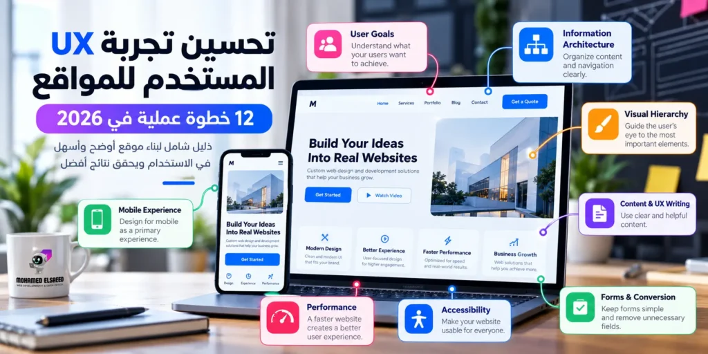
1. Start With the User’s Goal, Not the Page Layout
One of the most useful UX questions is also one of the simplest:
What is the user trying to accomplish here?
For a service business, the journey may be:
Search → Service Page → Proof → Contact.
For an ecommerce store:
Category → Product → Cart → Checkout.
For a real estate website:
Search → Filter → Property → Compare → Enquire.
For an LMS:
Discover Course → Evaluate → Enroll → Learn → Track Progress.
When you understand the primary task, the structure of the page becomes easier to evaluate.
A section is not valuable simply because it looks impressive.
It should help answer a question, increase confidence, explain the offer, reduce uncertainty, or move the user toward the next logical action.
This is the same approach I use in my WordPress development and UI/UX process: understand the business, audience, goals, and requirements first, then shape the experience and content flow before development begins. محمد السعيد | مطور ومصمم مواقع ووردبريس
2. Build an Information Architecture Users Can Understand
Information architecture is the way information is grouped, labeled, and connected across a website.
Users should not need to understand your company’s internal organization in order to navigate your site.
A business with fifteen services, for example, could place all fifteen services directly in the main navigation.
Technically, that gives users access to everything.
Practically, it may create unnecessary cognitive load.
Grouping related services into clear categories can make the same content easier to understand and explore.
Information architecture affects much more than the main menu.
It includes page hierarchy, service categories, blog categories, breadcrumbs, ecommerce taxonomies, filters, search, footer navigation, and contextual internal links.
A good structure should answer three questions:
Where am I?
What can I find here?
Where can I go next?
This also matters for content-driven websites. My on-page SEO guide discusses how clear structure, descriptive links, content hierarchy, and user experience work together rather than treating SEO as keyword placement alone. محمد السعيد | مطور ومصمم مواقع ووردبريس
3. Use Visual Hierarchy to Show What Matters First
Users rarely read an entire webpage word by word when they first arrive.
They scan.
They look for the page topic, important information, evidence, and the next action.
Visual hierarchy helps the interface communicate that priority.
Your H1 should look more important than supporting text.
A primary CTA should be more noticeable than a secondary link.
Related information should visually belong together.
Supporting details should not compete with the main message.
One common problem is giving every element equal visual weight.
If the hero section contains three equally prominent buttons, multiple badges, animation, several colors, large statistics, and a rotating headline, the user has to decide what matters.
The interface should make that decision easier.
Visual hierarchy is not about making everything bigger.
It is about controlling attention.

4. Make Navigation Predictable
Creative navigation can look impressive in a portfolio screenshot while creating unnecessary friction for real users.
People already have expectations about how websites work.
They expect the logo to lead home.
They expect navigation to be discoverable.
They expect links to look interactive.
They expect forms to behave like forms.
They expect a shopping cart to be accessible when shopping.
Breaking familiar patterns should therefore have a clear benefit.
Nielsen’s usability heuristics include consistency and standards, visibility of system status, user control, error prevention, and recognition rather than recall. These are broad principles rather than strict interface rules, but they remain useful when reviewing how understandable an interaction is. Nielsen Norman Group
A user should spend their attention on your content or service—not on discovering how your navigation works.
5. Treat Mobile UX as a Primary Experience
Responsive design does not mean shrinking a desktop page until it fits on a smaller screen.
Mobile changes the context of use.
The viewport is smaller.
Touch replaces the mouse.
Typing can be slower.
The user’s attention may be more fragmented.
Menus, filters, forms, tables, comparison tools, and CTAs may all require different decisions.
For example, a desktop layout may comfortably show a large navigation menu, multiple buttons, and a complex filter sidebar.
On mobile, that same interface may need a compact menu, an off-canvas filter, fewer competing actions, larger tap targets, and a different order of information.
The best way to review mobile UX is not only through a browser’s responsive preview.
Use a real phone and complete important tasks yourself.
Open the menu.
Find a service.
Send a form.
Search for a product.
Use the filters.
Add something to the cart.
Complete checkout.
Log into an account.
If the task becomes significantly harder when the screen becomes smaller, the design is responsive in width—but not necessarily in experience.
6. Make Content Part of the User Experience
Good UX cannot compensate for unclear copy.
A visually impressive hero that says:
“Creating the future of digital innovation”
may sound polished but tell the user almost nothing.
A more direct headline such as:
“WordPress Development for Service Businesses and Ecommerce Brands”
communicates value much faster.
UX writing also applies to smaller interface elements.
Button labels, form instructions, validation errors, empty states, confirmation messages, filters, headings, and search feedback all affect how users understand a product.
Compare:
Submit
with:
Request a Quote
The second label communicates what the action does.
Likewise, an error message should not simply say:
Something went wrong.
When possible, it should explain what happened and how the user can fix it.
Clear copy reduces uncertainty.
And reducing uncertainty is part of improving UX.
7. Simplify Forms Without Removing Important Information
Forms are where many websites convert attention into action.
They are also where unnecessary friction becomes extremely visible.
Every field asks the user for time, effort, and information.
That does not mean all forms should contain only two fields.
A mortgage application and a simple contact form clearly require different amounts of information.
The useful question is:
Do we genuinely need this information at this stage?
If the sales team initially needs only a name, contact method, and project type, asking for a full company profile, detailed budget, address, timeline, and ten other fields may make the first interaction unnecessarily demanding.
Accessibility matters here too.
W3C recommends properly associated labels for form controls and instructions that clearly explain requirements, formats, and other information users need to complete a form. W3C
A usable form should make required information obvious, preserve entered data when reasonable, associate errors with the relevant fields, and explain how the user can correct them.
Placeholder text alone should not carry information that disappears as soon as someone starts typing.
8. Design the States That Do Not Appear in the Mockup
Design files often show ideal conditions.
A populated dashboard.
A successful checkout.
Perfect search results.
Fast internet.
Valid form input.
Real users encounter much more.
What happens when a search returns zero results?
What happens when payment fails?
What happens when there is nothing in the cart?
What happens while content is loading?
What happens when an API is unavailable?
What happens when a user enters an invalid password?
What happens when a product variation is out of stock?
These states are part of UX.
A blank page after applying filters leaves the user to diagnose the problem.
A message such as:
“No products match all selected filters. Remove one filter to see more results.”
helps them recover.
Likewise, showing a visible loading state tells the user that their action has been received.
System feedback is not decorative.
It tells people what is happening.
9. Treat Website Performance as a UX Problem
Users do not experience your Lighthouse report.
They experience the page.
A beautiful button that takes too long to respond is a poor interaction.
A carefully designed hero that jumps around while loading feels unstable.
A mobile menu that opens after a visible delay feels broken even if it technically works.
Core Web Vitals currently focus on three dimensions of real-world experience: Largest Contentful Paint (LCP) for loading performance, Interaction to Next Paint (INP) for responsiveness, and Cumulative Layout Shift (CLS) for visual stability.
The current “good” thresholds are LCP within 2.5 seconds, INP within 200 milliseconds, and CLS at 0.1 or below, assessed at the 75th percentile of page visits. Google for Developers
Performance should therefore influence design and development decisions early.
Do we need this animation library?
Is this image larger than the displayed dimensions?
Does every page need this script?
Are we loading features that users rarely see?
Is the DOM unnecessarily complex?
Does the first viewport depend on too many resources?
For WordPress specifically, I explore the practical side of this in my WordPress speed optimization guide, including caching, images, CSS, JavaScript, hosting, and testing real functionality after optimization. محمد السعيد | مطور ومصمم مواقع ووردبريس

10. Include Accessibility in UX Decisions
Accessibility should not be added at the end of the design process as a separate checkbox.
Many accessibility improvements also create a clearer interface for everyone.
Readable contrast improves visibility.
Proper labels make forms easier to understand.
Keyboard navigation supports users who cannot rely on a mouse.
Visible focus states show where interaction currently is.
Logical headings make long pages easier to understand.
Useful error messages improve recovery.
Adequate target sizes reduce accidental taps.
WCAG 2.2 remains the current W3C recommendation and includes criteria addressing areas such as focus visibility, dragging movements, target size, consistent help, redundant entry, and accessible authentication. W3C
Accessibility also highlights an important distinction between visual design and implementation.
A mockup can look accessible while the coded website uses incorrect semantics, inaccessible controls, poor focus management, or unlabeled fields.
UX therefore continues into development.
11. Review Journeys, Not Only Individual Pages
A website can contain well-designed pages and still provide a frustrating journey.
Imagine an ecommerce website where the product page, cart, and checkout each look polished.
But when users move from cart to checkout, a selected option disappears.
Or the shipping price suddenly changes.
Or they are forced to create an account without prior warning.
The issue is not a single page.
It exists between pages.
This is why UX reviews should include complete user journeys.
For ecommerce, test product discovery through checkout.
For service websites, test search through enquiry.
For SaaS, test registration through first meaningful action.
For learning platforms, test course discovery through lesson access.
This principle became especially important in the Atom Academy LMS project, where the experience had to organize a large educational curriculum across course discovery, enrollment, structured lessons, assessments, student accounts, and progress rather than treating each screen as an isolated page. محمد السعيد | مطور ومصمم مواقع ووردبريس
When a product contains multiple steps, UX lives in the transitions between them.
12. Use Evidence Instead of Designing Only From Opinion
Design always involves judgment.
But UX improves when judgment is supported by evidence.
There is a meaningful difference between saying:
“I think users can find the button.”
and observing several target users who fail to notice it while completing the same task.
Useful evidence can come from analytics, funnels, form completion data, search queries, support conversations, session recordings, heatmaps, surveys, usability tests, and performance data.
No single source tells the whole story.
Analytics may show where people leave without explaining why.
A usability test may reveal the reason.
Customer support questions may expose information that users repeatedly fail to find.
Search data can reveal terminology your audience uses differently from your internal team.
NN/g’s usability guidance emphasizes improving usability through early and repeated testing with real users rather than relying only on internal assumptions. Nielsen Norman Group
You do not always need a large research department.
Even focused task-based testing can reveal problems that are almost invisible to a team that already knows how the website works.
How to Run a Practical UX Audit
A UX audit does not have to begin with a redesign.
In fact, redesigning before diagnosing the problem can replace one set of assumptions with another.
Start by identifying what success means for the website.
For one project, the primary goal may be completed enquiries.
For another, purchases.
For another, bookings, account activation, course enrollment, or successful use of a product feature.
Next, identify the user journeys most closely connected to that goal.
A service business might prioritize Home → Service → Portfolio → Contact.
An ecommerce site might prioritize Category → Product → Cart → Checkout.
Then conduct a heuristic review.
Look for unclear system feedback, inconsistent interface behavior, unnecessary memory load, difficult error recovery, confusing terminology, weak visual hierarchy, and places where users can easily make mistakes.
After that, test mobile behavior, performance, accessibility, forms, and the most important end-to-end tasks.
Finally, prioritize findings.
A cosmetic inconsistency should not receive the same urgency as a checkout error that prevents purchases.
A useful UX audit should therefore produce not only a list of problems, but also a clear order for solving them.
How Do You Know Your Website Needs a UX Audit?
A UX audit can be valuable when website traffic exists but users rarely complete important actions.
It can also help when customers regularly ask support questions about information that already exists on the website, when forms show high abandonment, when users struggle with mobile navigation, or when a site has expanded significantly since its original architecture was created.
Another common case is a redesign that improved appearance but did not improve how easily users complete tasks.
None of these signals proves that UX is the only cause.
Pricing, traffic quality, product-market fit, content, trust, and technical issues can all affect outcomes.
The goal of a UX audit is not to blame every business problem on the interface.
It is to determine whether the website is adding avoidable friction.
Website UX for Ecommerce
Ecommerce UX deserves particular attention because users make a series of decisions before purchasing.
They need to discover products, understand differences, evaluate information, select variations, trust the store, understand delivery, add items to a cart, and complete payment.
Each step can introduce friction.
Product search and filters should help narrow choices rather than create confusion.
Product pages should make critical information easy to find.
Variations should clearly change the relevant price, image, availability, or configuration.
Shipping information should not feel intentionally hidden until checkout.
Errors during payment should provide enough information for customers to recover.
The goal is not to remove all information in the name of minimalism.
It is to present the right information at the right stage of the decision.
If you are building or improving a store, my WooCommerce setup guide covers the wider store architecture around products, payments, shipping, performance, and user experience. محمد السعيد | مطور ومصمم مواقع ووردبريس
Website UX for Service Businesses
Service websites usually have a different user journey.
The visitor is often trying to answer a small set of questions quickly:
What do you do?
Can you solve my problem?
Do you serve my location or market?
Why should I trust you?
What should I do next?
This makes clarity especially important.
A strong service page usually needs a clear value proposition, useful details about the service, proof or relevant work, objections answered at the right time, and a visible next action.
That next action might be a form, phone call, booking, or WhatsApp conversation depending on the market and service.
The page should not make users scroll through generic statements simply to discover what is actually being offered.
My WordPress website development service is structured around the same principle: discovery and planning come before UI/UX, development, testing, and launch, because the website should be built around the business and user journey rather than around a template demo. محمد السعيد | مطور ومصمم مواقع ووردبريس
UX for Learning Platforms and LMS Websites
Learning platforms have a longer user journey than many marketing websites.
The experience does not end after conversion.
Students may need to discover a course, compare options, enroll, log in, access the curriculum, understand progress, complete lessons, take quizzes, find resources, and resume where they left off.
This makes information architecture critical.
A course containing dozens of lessons cannot simply become one long list.
The platform needs logical sections, progress cues, clear assessment states, predictable navigation, and a dashboard that helps learners understand where they are.
The UX challenge is therefore both commercial and educational.
The website needs to help users make an enrollment decision and then continue supporting them after purchase.
Multilingual and RTL User Experience
International websites add another UX layer.
Translation alone does not create a localized experience.
When English and Arabic coexist, for example, layout direction changes.
Navigation, arrows, breadcrumbs, sliders, forms, icons, mixed-language text, numbers, and component spacing all need to be reviewed.
Arabic typography may also require different line-height and sizing decisions from Latin typography.
A button designed around a short English label may break when the translated Arabic wording becomes longer.
The same applies in the opposite direction.
The interface should therefore be designed as a flexible system rather than a fixed screenshot.
This is particularly relevant to my own work because I build bilingual and multilingual WordPress projects with localized English and Arabic experiences, including RTL support. You can read more about my UI/UX and WordPress background on my Mohamed Elsaeed profile. محمد السعيد | مطور ومصمم مواقع ووردبريس
UX and SEO: What Is the Real Relationship?
UX and SEO overlap, but they are not the same discipline.
A common oversimplification is:
Better UX automatically means higher Google rankings.
That is not accurate.
Google currently states that there is no single “page experience signal.” Its systems consider multiple signals related to overall page experience, and good Core Web Vitals alone do not guarantee top rankings. Google for Developers
At the same time, many good UX practices support a strong search experience.
Clear content architecture helps users and search engines understand pages.
Useful internal links improve discovery.
Mobile usability matters to visitors.
Performance affects interaction.
Readable layouts help people consume content.
Clear separation between main content and distracting elements makes pages easier to use.
Google’s guidance also continues to emphasize helpful, reliable, people-first content rather than content created primarily to manipulate search rankings. Google for Developers
The useful approach is therefore not to design UX “for Google.”
Design a useful website for people while making sure its architecture and implementation also allow search engines to understand and access the content.
Common UX Mistakes I See on WordPress Websites
One recurring mistake is treating a theme demo as the website strategy.
Demo pages are created to showcase design possibilities. They do not know your audience, content, conversion path, information architecture, or business goals.
Another problem is building section after section without a clear journey.
A website can contain all the “right” blocks—hero, features, counters, testimonials, FAQ, CTA—and still feel confusing if those blocks are not arranged around the questions users actually have.
Another frequent issue is using animation to compensate for weak hierarchy.
Motion can provide feedback and direct attention, but excessive motion can slow down pages and compete with the content.
There is also the opposite problem: using a new WordPress plugin every time the website needs a small UX change.
Not every design problem requires new functionality.
Sometimes the right fix is a clearer heading, a shorter form, a better navigation structure, or removing an unnecessary step.
And finally, many websites receive extensive attention on the homepage while their service pages, product pages, articles, and mobile flows receive much less.
Search users often enter directly through an internal page.
Every important landing page needs enough context to work on its own.
A Quick UX Checklist Before Launch
Before considering a website finished, test whether a first-time visitor can understand the page purpose quickly, identify the primary action, navigate comfortably on mobile, read the content without unnecessary effort, complete forms with clear guidance, recover from errors, use interactive controls by keyboard where appropriate, and complete the main user journey without confusion.
Then test performance and stability.
Check whether interaction feels immediate.
Check whether elements move unexpectedly while loading.
Check whether the mobile experience retains the priorities of the desktop version.
Finally, ask someone unfamiliar with the project to complete a real task without your help.
Watching someone use the website often reveals more than another hour of looking at the design.
Frequently Asked Questions About Website UX
What Is Website User Experience?
Website user experience is the overall experience someone has while interacting with a website, including how easily they understand it, navigate it, complete tasks, recover from problems, and achieve their goal. UX also includes factors such as accessibility, usefulness, credibility, usability, and satisfaction. Nielsen Norman Group
What Is the Difference Between UI and UX?
UI focuses on the visual and interactive interface, while UX considers the wider relationship between the user and the product, including information architecture, journeys, content, usability, performance, and task completion.
How Can I Improve My Website’s User Experience?
Start by identifying user goals and key journeys. Then review information architecture, navigation, visual hierarchy, content, mobile usability, forms, error states, performance, accessibility, and real user behavior. Improvements should solve identified problems rather than simply change the visual style.
What Is a UX Audit?
A UX audit is a structured review of an existing digital product designed to identify usability problems, friction points, unclear journeys, accessibility issues, and opportunities for improvement. A useful audit prioritizes findings instead of treating every issue as equally important.
Do I Need to Redesign My Entire Website to Improve UX?
Not necessarily. A website may need a better mobile menu, shorter form, clearer service page, improved checkout, faster interaction, or stronger content hierarchy rather than a complete redesign.
Is Website Speed Part of UX?
Yes. Loading, responsiveness, and visual stability directly influence how the interface feels to users. Core Web Vitals measure important parts of these experiences through LCP, INP, and CLS. Google for Developers
Does Better UX Increase Conversions?
Better UX can remove obstacles that prevent users from contacting, purchasing, registering, or completing other actions. However, conversions also depend on factors such as offer quality, price, traffic relevance, trust, messaging, and market demand. UX should improve the journey without being treated as a guarantee of business results.
Does UX Improve SEO?
UX can support SEO through better page experience, performance, content structure, mobile usability, and navigation, but good UX does not automatically produce higher rankings. Google evaluates many systems and signals, and strong Core Web Vitals alone do not guarantee top positions. Google for Developers
Better UX Starts With Understanding the Problem Before Designing the Solution
Improving user experience does not always mean adding something.
Often it means removing something.
One unnecessary step.
One confusing menu item.
One field from a form.
One competing CTA.
One heavy animation.
One vague paragraph.
One interaction that users should never have needed to understand.
A professional user experience makes the website feel easier because the difficult decisions have already been handled during research, planning, design, and development.
That is the standard I try to apply when working across WordPress development and UI/UX: the interface should look professional, but it should also make sense, respond well, scale across devices, and support the actual goal of the project.
You can explore examples of my work across ecommerce, service websites, real estate, corporate sites, and learning platforms in my WordPress and UI/UX portfolio. محمد السعيد | مطور ومصمم مواقع ووردبريس
If you are planning a new website or improving an existing one, you can also explore my WordPress development and UI/UX services or discuss your project with me on WhatsApp.



Leave A Comment